
Stop wrestling with rigid UI libraries. Frontend development in 2026 demands speed, ownership, and zero lock-in. Material UI (MUI) was the old standard—a complete, opinionated system. But the development landscape has shifted. The rise of shadcn/ui signals a "copy-paste revolution." We break down the differences. This guide gives you the architecture you need to choose the right foundation. Build faster. Ship cleaner code.
TL;DR
- shadcn/ui: Choose for maximum customization, minimal bundle size, and modern stacks (Next.js + Tailwind). You own the source code.
- Material UI (MUI): Choose for complex, data-heavy enterprise applications needing battle-tested consistency and a massive component ecosystem out-of-the-box.
- Momentum: shadcn/ui’s rise reflects the 2025 developer preference for utility-first tools over traditional, opinionated libraries.
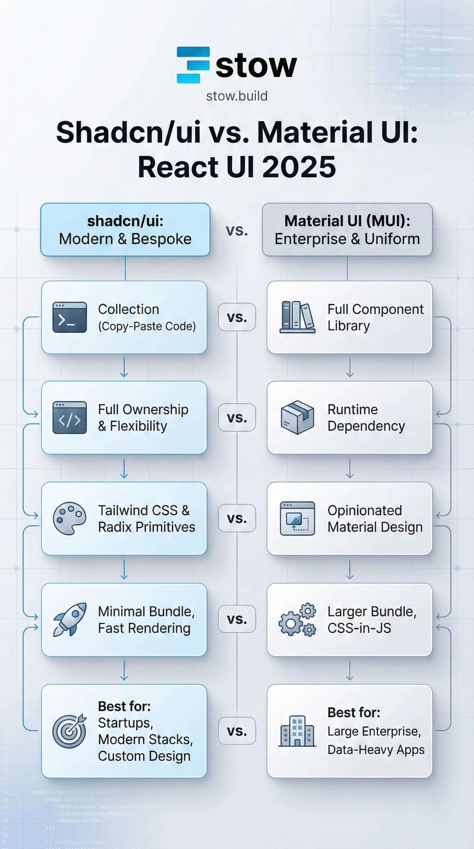
The Architectural Divide: Library vs. Collection
The core of the shadcn/ui vs. MUI debate is a fundamental difference in architecture. You must understand this to make the right choice.
Material UI (MUI): The Full System
MUI is a comprehensive component library.
- It implements the rigorous Material Design system by Google.
- You install it via npm, and its components become runtime dependencies.
- It ships with a vast ecosystem, including advanced features like DataGrid and Date Picker.
- MUI’s strength is in uniformity and consistency.
shadcn/ui: The Open Code Revolution
shadcn/ui is a collection of re-usable components. It’s often mistaken for a library, but it's not.
- It uses a CLI to literally copy the component source code directly into your project's repo.
- It's built on Radix UI primitives for accessibility and Tailwind CSS for styling.
- No npm dependencies or runtime overhead beyond the copied code.
- Its strength is full ownership and flexibility.
Core Difference 1: Styling and Customization
MUI's Theming System
MUI uses CSS-in-JS (Emotion or styled-components). Customization is handled via a complex theming system and prop overrides.
- You get instant professional polish.
- Overriding non-Material Design styles can become a maintenance nightmare.
- It often requires digging through component source to achieve minor tweaks.
shadcn/ui's Tailwind Approach
shadcn/ui is built for the utility-first world.
- Styling is done via standard Tailwind CSS classes.
- Since you own the code, you can change any class, add arbitrary CSS, or even rewrite the component logic.
- Zero vendor lock-in. This is the modern way to build.
Core Difference 2: Ownership and Flexibility
This is where the shadcn philosophy truly shines.
With shadcn/ui, You Own It
When you run npx shadcn-ui@latest add button, the code becomes yours. You are not fighting a black box.
- Full TS ownership. You can refactor, optimize, or replace any part without waiting for the library maintainers.
- Composition pattern. shadcn components are designed to be composable and easy to integrate with AI tools like Vercel v0.
MUI’s Trade-Off
MUI provides a massive suite of features, but you must adhere to its architecture.
- Deep theming is available, but non-Material overrides feel rigid.
- You are reliant on the MUI team for framework support and bug fixes.
- This structure is excellent for large teams needing guaranteed consistency.
Core Difference 3: Performance and Bundle Size
For high-performance applications, the difference is stark.
| Aspect | shadcn/ui | Material UI (MUI) |
|---|---|---|
| Runtime Dependencies | Minimal (Radix primitives) | Heavier npm dependencies |
| Bundle Size | Minimal (~5-15KB per component) | Larger (∼200KB+, even with tree-shaking) |
| Rendering | Clean, fast HTML from Tailwind | CSS-in-JS can introduce render overhead |
Minimalism translates to speed. shadcn/ui’s architecture is built for today's edge-deployed, server-component-heavy applications.
Why Developers Are Choosing shadcn/ui Today
The 2025 developer sentiment favors speed and control.
- Superior DX (Developer Experience): CLI integration accelerates prototyping. You get clean, accessible components instantly.
- Modern Accessibility: Radix primitives ensure ARIA compliance out of the box, removing accessibility overhead.
- No Bloat: You only ship the code you actually use. Reclaim control of your bundle size and build times.
- Tailwind Native: It’s the default choice for any new project using the Next.js/Tailwind stack.
Why MUI Still Wins in Enterprise
shadcn/ui’s momentum is undeniable, but MUI is still the champion for specific use cases.
- Enterprise-Ready Ecosystem: MUI’s mature, vast component library is unmatched. Teams building complex DataGrid or dashboard systems often rely on this breadth.
- Maturity and Trust: Since 2014, MUI has been battle-tested in production at the largest scale. The stability and documentation are world-class.
- Instant Uniformity: If your team needs to ship an app with instant, guaranteed professional polish—like an internal admin dashboard—MUI's Material Design provides it without requiring a deep Tailwind expert.
The Final Verdict
Choose the tool that matches your project's DNA.
| Scenario | Recommendation | Rationale |
|---|---|---|
| Startup / Solo Dev | shadcn/ui | Build fast, own the code, pivot quickly. Ship an MVP in a week. |
| Custom Branding | shadcn/ui | Full control over every CSS utility. No theme fighting. |
| Large Enterprise App | Material UI | Requires data-heavy components, consistency, and a massive community. |
| Next.js + Tailwind | shadcn/ui | The native choice. Seamless integration and performance. |
Stop coding the same boilerplate Button component for the fifth time. Save development hours. Stow is the marketplace for verified, high-quality code.
Ready to ship? Browse the Verified Stow Components.